Tutorial for microbiome analysis in R
BEFORE YOU START: This is a tutorial to analyze microbiome data with R. The tutorial starts from the processed output from metagenomic sequencing, i.e. feature matrix. It’s suitable for R users who wants to have hand-on tour of the microbiome world. This tutorial cover the common microbiome analysis e.g. alpha/beta diversity, differential abundance analysis).
- The demo data-set comes from the QIIME 2 tutorial - Moving Pictures.
- This is a beginner tutorial. You still have time to run away if you’re an experienced bioinformatician. 👻
What you will work on
After sequencing, you will get some (fastq/fast5/h5) files from the sequencing. These files contain the nucleotide information. If the sequenced sample is a mixed community, i.e. metagenomics, you need to identify where the reads come from (specific species and samples). There are plenty of strategies for metagenomics such as amplicon and shotgun sequencing. But you have more or less similar structural profiles:
- Feature table (Necessary), a matrix containing the abundances of detected microbial features (OTUs, ASVs, microbial markers)
- Taxonomy table (Optional), an array indicating the taxonomic assignment of features, which can be integrated in biom format.
- Phylogenetic tree (Optional), a phylogenetic tree indicating the evolutional similarity of microbial features, potentially used when calculating phylogenetic diversity metrics (optionally integrated in biom format).
- Metadata, a matrix containing the infomation for analysis (optionally integrated in biom format).
Preparation
Start with QIIME 2 output Here QIIME 2 data is adopted as an example. If you don’t have QIIME 2 output, you can skip the bash code for QIIME 2. All data is imported using R built-ins, but QIIME 2 outputs need extra steps outside R. QIIME 2 data files are defined in qza format , which are actually just zipped files. Below are data from the Moving Pictures in QIIME 2.
## rooted-tree.qza
## sample-metadata.tsv
## table.qza
## taxonomy.qza
Download sample-metadata.tsv, table.qza, taxonomy.qza and rooted-tree.qza, and name it accordingly.
As the R built-ins didn’t accept .qza or .biom files, here I give an example to transform these qza files to a R-like format. You need QIIME 2 (qiime2-2020.11) installed. Open the terminal and run the bash script below. Windows users shall enable WSL 2 (Windows Subsystem for Linux) or use visual machines instead.
conda activate qiime2-2020.11
for i in *.qza; do
qiime tools export --input-path $i --output-path .
done
biom convert -i feature-table.biom -o feature-table.tsv --to-tsv
conda deactivate
And you will have
## feature-table.tsv
## sample-metadata.tsv
## taxonomy.tsv
## tree.nwk
Install and load relevant packages: phyloseq, tidyverse, vegan, DESeq2 , ANCOMBC, ComplexHeatmap. The following code are solely written in R. Now you can open the Rstudio and repeat it.
p1 <- c("tidyverse", "vegan", "BiocManager")
p2 <- c("phyloseq", "ANCOMBC", "DESeq2", "ComplexHeatmap")
load_package <- function(p) {
  if (!requireNamespace(p, quietly = TRUE)) {
    ifelse(p %in% p1,
           install.packages(p, repos = "http://cran.us.r-project.org/"),
           BiocManager::install(p))
  }
  library(p, character.only = TRUE, quietly = TRUE)
}
invisible(lapply(c(p1,p2), load_package))
Build phyloseq project
To build a phyloseq project, the phyloseq description is here.
otu <- read.table(file = "feature-table.tsv", sep = "\t", header = T, row.names = 1,
                  skip = 1, comment.char = "")
taxonomy <- read.table(file = "taxonomy.tsv", sep = "\t", header = T ,row.names = 1)

# clean the taxonomy, Greengenes format
tax <- taxonomy %>%
  select(Taxon) %>%
  separate(Taxon, c("Kingdom", "Phylum", "Class", "Order", "Family", "Genus", "Species"), "; ")

tax.clean <- data.frame(row.names = row.names(tax),
                        Kingdom = str_replace(tax[,1], "k__",""),
                        Phylum = str_replace(tax[,2], "p__",""),
                        Class = str_replace(tax[,3], "c__",""),
                        Order = str_replace(tax[,4], "o__",""),
                        Family = str_replace(tax[,5], "f__",""),
                        Genus = str_replace(tax[,6], "g__",""),
                        Species = str_replace(tax[,7], "s__",""),
                        stringsAsFactors = FALSE)

tax.clean[is.na(tax.clean)] <- ""
tax.clean[tax.clean=="__"] <- ""

for (i in 1:nrow(tax.clean)){
  if (tax.clean[i,7] != ""){
    tax.clean$Species[i] <- paste(tax.clean$Genus[i], tax.clean$Species[i], sep = " ")
  } else if (tax.clean[i,2] == ""){
    kingdom <- paste("Unclassified", tax.clean[i,1], sep = " ")
    tax.clean[i, 2:7] <- kingdom
  } else if (tax.clean[i,3] == ""){
    phylum <- paste("Unclassified", tax.clean[i,2], sep = " ")
    tax.clean[i, 3:7] <- phylum
  } else if (tax.clean[i,4] == ""){
    class <- paste("Unclassified", tax.clean[i,3], sep = " ")
    tax.clean[i, 4:7] <- class
  } else if (tax.clean[i,5] == ""){
    order <- paste("Unclassified", tax.clean[i,4], sep = " ")
    tax.clean[i, 5:7] <- order
  } else if (tax.clean[i,6] == ""){
    family <- paste("Unclassified", tax.clean[i,5], sep = " ")
    tax.clean[i, 6:7] <- family
  } else if (tax.clean[i,7] == ""){
    tax.clean$Species[i] <- paste("Unclassified ",tax.clean$Genus[i], sep = " ")
  }
}

metadata <- read.table(file = "sample-metadata.tsv", sep = "\t", header = T, row.names = 1)
OTU = otu_table(as.matrix(otu), taxa_are_rows = TRUE)
TAX = tax_table(as.matrix(tax.clean))
SAMPLE <- sample_data(metadata)
TREE = read_tree("tree.nwk")
# merge the data
ps <- phyloseq(OTU, TAX, SAMPLE,TREE)
There’s one loop to clean the Greengene format taxonomy. See what has happened there?
Before
After
Tips: The cleaning process helps when you want to collapse the feature table at one specific level, e.g. species or genus. The taxonomy of feature is identified by the LCA algorithm, so it’s possible that some features are merely classified at genus or family level due to the sequence homology. The loop is just to iteratively fill in the gaps with respective lowest taxonomic classification, resulting in more details in visualization.
An integrated phyloseq project looks like
## phyloseq-class experiment-level object
## otu_table()   OTU Table:         [ 770 taxa and 34 samples ]
## sample_data() Sample Data:       [ 34 samples by 8 sample variables ]
## tax_table()   Taxonomy Table:    [ 770 taxa by 7 taxonomic ranks ]
## phy_tree()    Phylogenetic Tree: [ 770 tips and 768 internal nodes ]
Check the sequencing depth with rarefaction curves
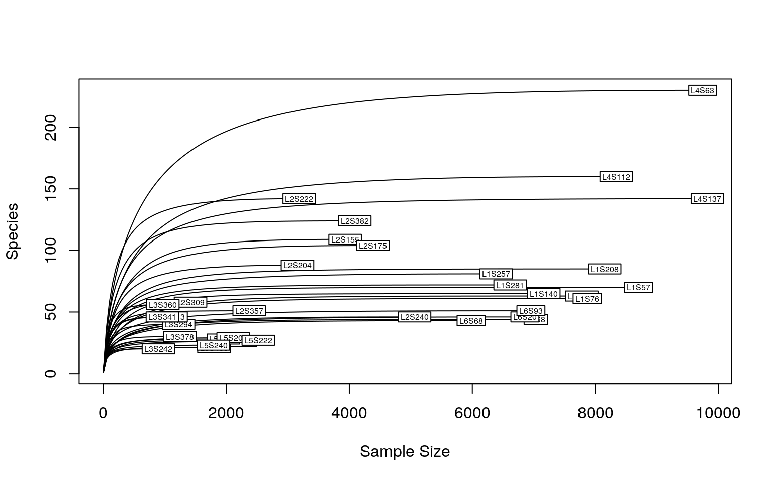
The sequencing depth is 4523.735 ± 2933.477 (mean ± SD), ranging from 897 to 9820.
As we could see, a sequencing depth of 1000 has captured most taxonomic tags. To minimize the bias from varying sequencing depth, rarefaction is recommended before calculating the diversity metrics. However, it’s not always the rule of thumb. To keep consistence with the Moving pictures tutorial, all samples are rarefied (re-sampled) to the sequencing depth of 1103. As it’s random sampling process, the result is unlikely to be identical as the Moving pictures tutorial
set.seed(111) # keep result reproductive
ps.rarefied = rarefy_even_depth(ps, rngseed=1, sample.size=1103, replace=F)
After rarefaction, the phyloseq looks like
## phyloseq-class experiment-level object
## otu_table()   OTU Table:         [ 666 taxa and 31 samples ]
## sample_data() Sample Data:       [ 31 samples by 8 sample variables ]
## tax_table()   Taxonomy Table:    [ 666 taxa by 7 taxonomic ranks ]
## phy_tree()    Phylogenetic Tree: [ 666 tips and 664 internal nodes ]
The sequencing depth of all remaining 31 samples is 1103.
Alpha diversity
Alpha diversity metrics assess the species diversity within the ecosystems, telling you how diverse a sequenced community is.
plot_richness(ps.rarefied, x="body.site", measures=c("Observed", "Shannon")) +
  geom_boxplot() +
  theme_classic() +
  theme(strip.background = element_blank(), axis.text.x.bottom = element_text(angle = -90))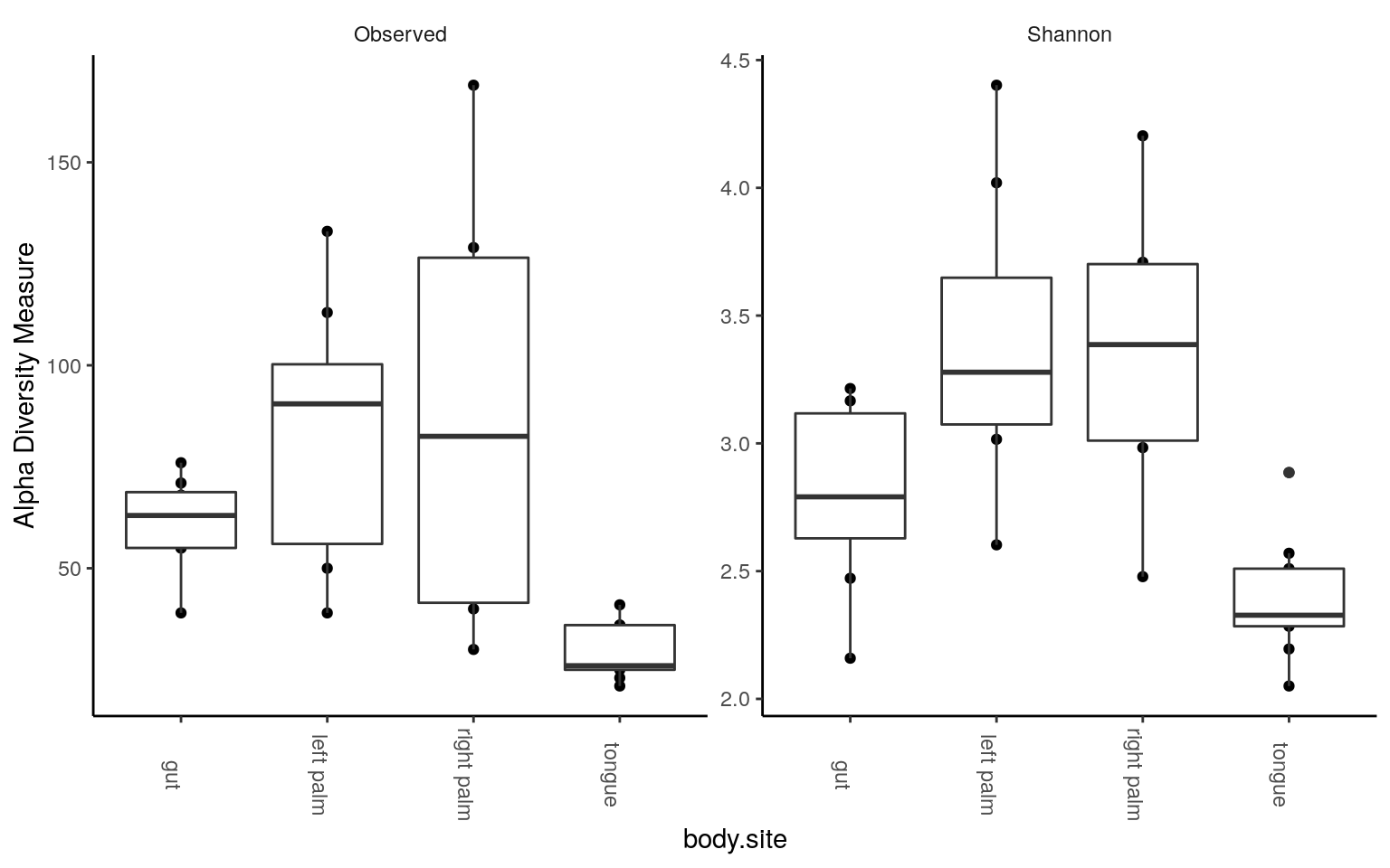
We could see tongue samples had the lowest alpha diversity. Next, some statistics: pairwise test with Wilcoxon rank-sum test, corrected by FDR method. For the number of observed tags,
rich = estimate_richness(ps.rarefied, measures = c("Observed", "Shannon"))
wilcox.observed <- pairwise.wilcox.test(rich$Observed,
                                        sample_data(ps.rarefied)$body.site,
                                        p.adjust.method = "BH")
tab.observed <- wilcox.observed$p.value %>%
  as.data.frame() %>%
  tibble::rownames_to_column(var = "group1") %>%
  gather(key="group2", value="p.adj", -group1) %>%
  na.omit()
tab.observed
Similarly for Shannon diversity,
Beta diversity
Beta diversity metrics assess the dissimilarity between ecosystem, telling you to what extend one community is different from another. Here are some demo code using Bray Curtis and binary Jaccard distance metrics. I personally do not recommend directly using the UniFrac metrics supported by phyloseq, especially when your tree is not dichotomous. This will happen when some children branches lose their parents in rarefaction.😭 You need to re-root your tree in e.g. QIIME 2 if you run into this case, see here. Besides, the UniFrac distance calculation by phyloseq has not been checked with the source code, see the posts in phyloseq issues and QIIME 2 forum. So it’s safer to use QIIME 2 version given that both QIIME and UniFrac concepts came from the Knight lab.
PCoA and PERMANOVA/ADONIS
- Bray curtis
distance is in overlapped use, so we specify the package by phyloseq::distance
dist = phyloseq::distance(ps.rarefied, method="bray")
ordination = ordinate(ps.rarefied, method="PCoA", distance=dist)
plot_ordination(ps.rarefied, ordination, color="body.site") +
  theme_classic() +
  theme(strip.background = element_blank())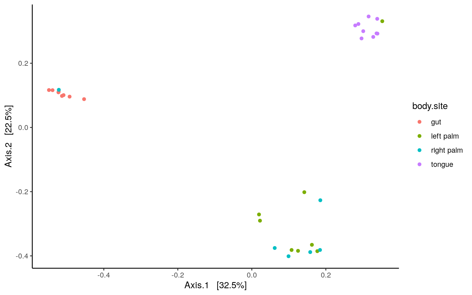
PERMANOVA/ADONIS
metadata <- data.frame(sample_data(ps.rarefied))
test.adonis <- adonis(dist ~ body.site, data = metadata)
test.adonis <- as.data.frame(test.adonis$aov.tab)
test.adonis
PAIRWISE PERMANOVA
cbn <- combn(x=unique(metadata$body.site), m = 2)
p <- c()

for(i in 1:ncol(cbn)){
ps.subs <- subset_samples(ps.rarefied, body.site %in% cbn[,i])
metadata_sub <- data.frame(sample_data(ps.subs))
permanova_pairwise <- adonis(phyloseq::distance(ps.subs, method = "bray") ~ body.site,
                             data = metadata_sub)
p <- c(p, permanova_pairwise$aov.tab$`Pr(>F)`[1])
}

p.adj <- p.adjust(p, method = "BH")
p.table <- cbind.data.frame(t(cbn), p=p, p.adj=p.adj)
p.table
As we could see, there’s no difference in composition between the left and right palm samples. Similar result can be found using binary Jaccard metrics. Adjust the script of PERMANOVA/ADONIS accordingly with the code blow:
and
Give it a try.
NMDS and ANOSIM
The microbiome data is compositional and sparse. Non-parametric multidimentional scaling (NMDS) is favored also, usually aligned with ANOSIM test.
- Binary Jaccard
dist = phyloseq::distance(ps.rarefied, method="jaccard", binary = TRUE)
ordination = ordinate(ps.rarefied, method="NMDS", distance=dist)plot_ordination(ps.rarefied, ordination, color="body.site") +
theme_classic() +
theme(strip.background = element_blank())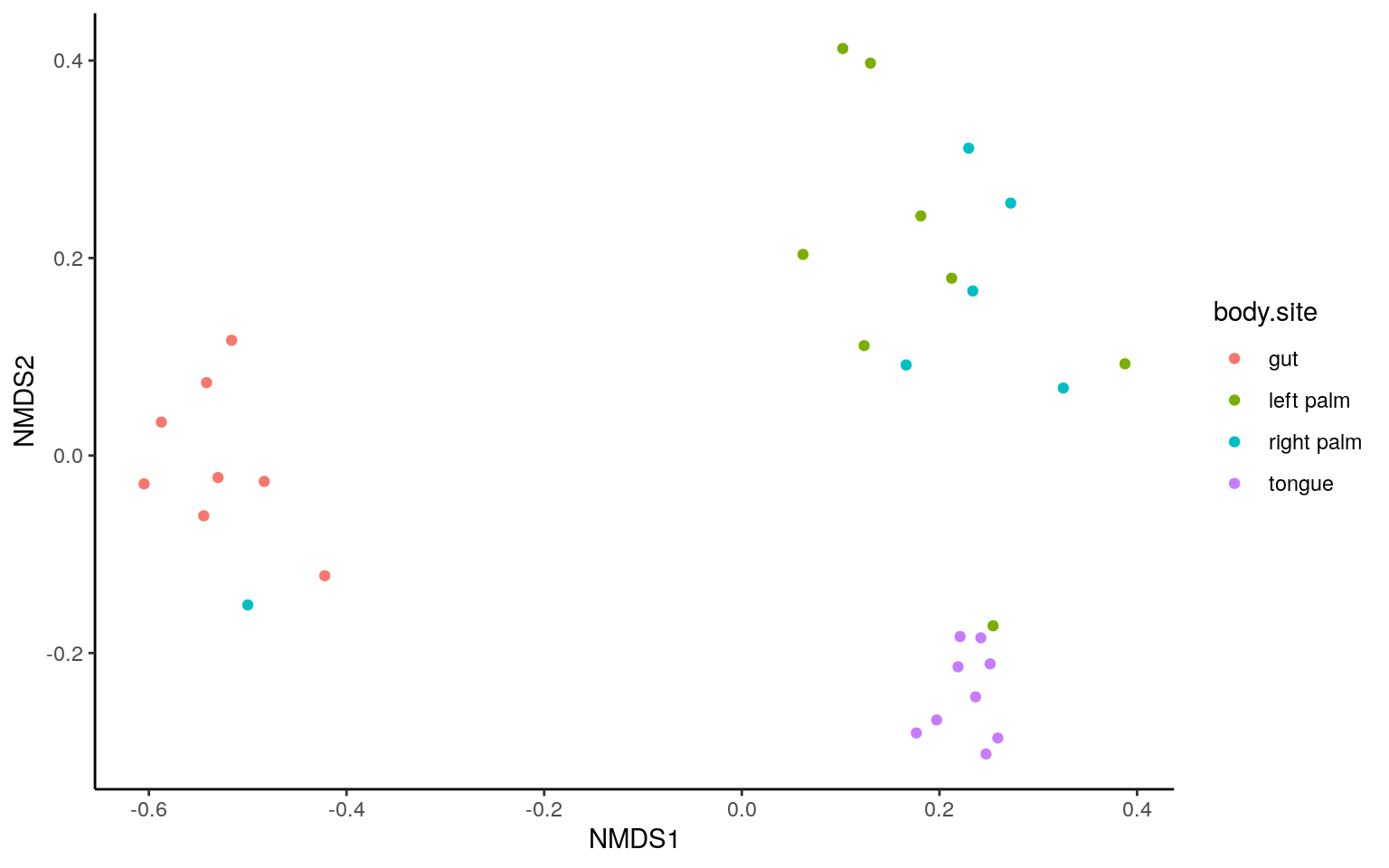
ANOSIM
##
## Call:
## anosim(x = dist, grouping = metadata$body.site)
## Dissimilarity: binary jaccard
##
## ANOSIM statistic R: 0.785
##       Significance: 0.001
##
## Permutation: free
## Number of permutations: 999
PAIRWISE ANOSIM
cbn <- combn(x=unique(metadata$body.site), m = 2)
p <- c()

for(i in 1:ncol(cbn)){
ps.subs <- subset_samples(ps.rarefied, body.site %in% cbn[,i])
metadata_sub <- data.frame(sample_data(ps.subs))
permanova_pairwise <- anosim(phyloseq::distance(ps.subs, method="jaccard", binary = TRUE),
                             metadata_sub$body.site)
p <- c(p, permanova_pairwise$signif[1])
}

p.adj <- p.adjust(p, method = "BH")
p.table <- cbind.data.frame(t(cbn), p=p, p.adj=p.adj)
The NMDS and ANOSIM result were similar to that from PCoA and ADONIS.
Abundance bar plot
Here the demos use a un-rarefied table to visualize all detected tags.
- Phylum
ps.rel = transform_sample_counts(ps, function(x) x/sum(x)*100)
# agglomerate taxa
glom <- tax_glom(ps.rel, taxrank = 'Phylum', NArm = FALSE)
ps.melt <- psmelt(glom)
# change to character for easy-adjusted level
ps.melt$Phylum <- as.character(ps.melt$Phylum)

ps.melt <- ps.melt %>%
  group_by(body.site, Phylum) %>%
  mutate(median=median(Abundance))
# select group median > 1
keep <- unique(ps.melt$Phylum[ps.melt$median > 1])
ps.melt$Phylum[!(ps.melt$Phylum %in% keep)] <- "< 1%"
#to get the same rows together
ps.melt_sum <- ps.melt %>%
  group_by(Sample,body.site,Phylum) %>%
  summarise(Abundance=sum(Abundance))

ggplot(ps.melt_sum, aes(x = Sample, y = Abundance, fill = Phylum)) +
  geom_bar(stat = "identity", aes(fill=Phylum)) +
  labs(x="", y="%") +
  facet_wrap(~body.site, scales= "free_x", nrow=1) +
  theme_classic() +
  theme(strip.background = element_blank(),
        axis.text.x.bottom = element_text(angle = -90))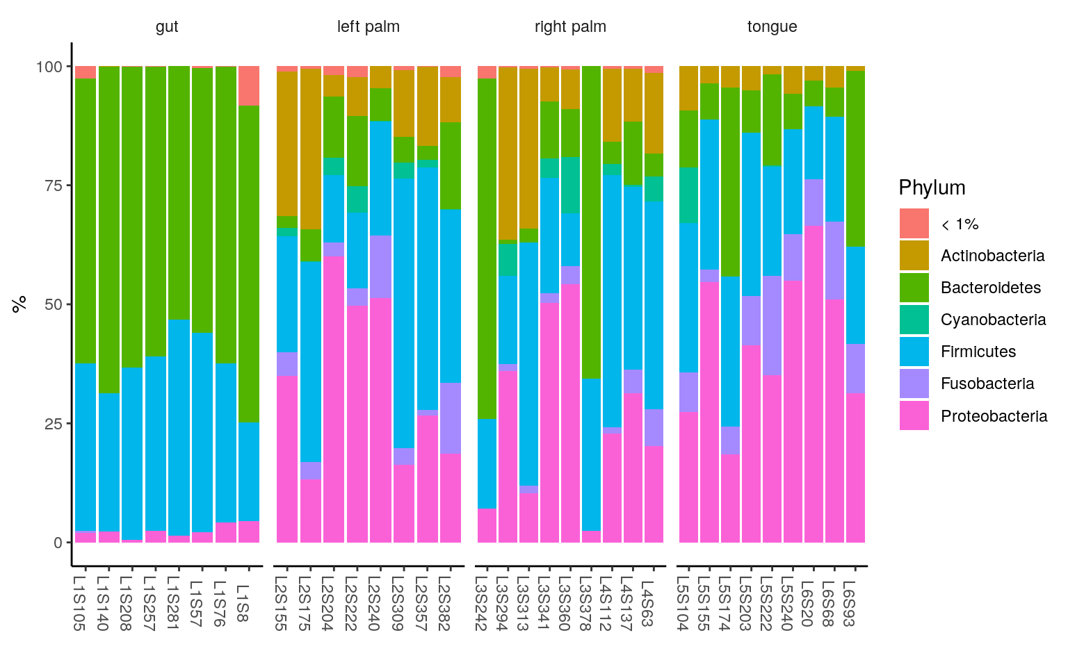
< 1% indicates the rare taxa in each group, with median relative abundance < 1%.
- Genus
ps.rel = transform_sample_counts(ps, function(x) x/sum(x)*100)
# agglomerate taxa
glom <- tax_glom(ps.rel, taxrank = 'Genus', NArm = FALSE)
ps.melt <- psmelt(glom)
# change to character for easy-adjusted level
ps.melt$Genus <- as.character(ps.melt$Genus)

ps.melt <- ps.melt %>%
  group_by(body.site, Genus) %>%
  mutate(median=median(Abundance))
# select group mean > 1
keep <- unique(ps.melt$Genus[ps.melt$median > 2.5])
ps.melt$Genus[!(ps.melt$Genus %in% keep)] <- "< 2.5%"
#to get the same rows together
ps.melt_sum <- ps.melt %>%
  group_by(Sample,body.site,Genus) %>%
  summarise(Abundance=sum(Abundance))

ggplot(ps.melt_sum, aes(x = Sample, y = Abundance, fill = Genus)) +
  geom_bar(stat = "identity", aes(fill=Genus)) +
  labs(x="", y="%") +
  facet_wrap(~body.site, scales= "free_x", nrow=1) +
  theme_classic() +
  theme(legend.position = "right",
        strip.background = element_blank(),
        axis.text.x.bottom = element_text(angle = -90))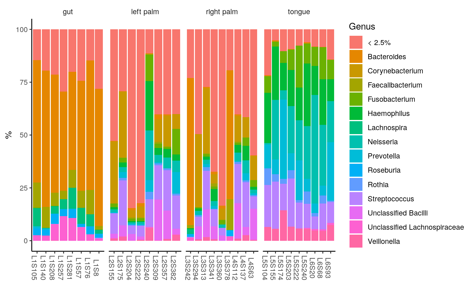
< 2.5% indicates the rare taxa in each group, with median relative abundance < 2.5%.
Differential abundance analysis
Differential abundance analysis allows you to identify differentially abundant taxa between groups. There’s many methods, here two commonly used ones are given as examples. Features are collapsed at the species-level prior to the calculation.
sample_data(ps)$body.site <- as.factor(sample_data(ps)$body.site) # factorize for DESeq2
ps.taxa <- tax_glom(ps, taxrank = 'Species', NArm = FALSE)
Let’s see what features are enriched differentially between tongue and gut samples.
DESeq2
DESeq2 is a software designed for RNA-seq, but also used in microbiome analysis, and the detailed use of DESeq2 can be found here. You may be troubled by the “zero” issues in microbiome analysis. A pseudo count is added to avoid the errors in logarithm transformation.
You may be troubled by the “zero” issues in microbiome analysis. Previously, a pseudo count is suggested to avoid the errors. However, the pseduo count violates the negative binomial distribution assumption of DESeq2, increasing false postives. Phyloseq discussion According to the recent update,
estimateSizeFactorsintroduces alternate estimators (type="iterate"andtype="poscounts"), which can be used even when all genes contain a sample with a zero (Biostar Discussion 1, Biostar Discussion 2). For DESeq2, it’s suggested to use alternative estimators for the size factors rather than use tranformed counts. Meanwhile, filtering sparse features (zeros in almost every observation) also benefits DESeq2 modelling. It’s highly suggested to go through the official DESeq2 manual if the experiment desgin is complex.Below we just filter features with more than 90% of zeros, for a quick demo.
# pairwise comparison between gut and tongue
ps.taxa.sub <- subset_samples(ps.taxa, body.site %in% c("gut", "tongue"))
# filter sparse features, with > 90% zeros
ps.taxa.pse.sub <- prune_taxa(rowSums(otu_table(ps.taxa.sub) == 0) < ncol(otu_table(ps.taxa.sub)) * 0.9, ps.taxa.sub)
ps_ds = phyloseq_to_deseq2(ps.taxa.pse.sub, ~ body.site)
# use alternative estimator on a condition of "every gene contains a sample with a zero"
ds <- estimateSizeFactors(ps_ds, type="poscounts")
ds = DESeq(ds, test="Wald", fitType="parametric")
alpha = 0.05
res = results(ds, alpha=alpha)
res = res[order(res$padj, na.last=NA), ]
taxa_sig = rownames(res[1:20, ]) # select bottom 20 with lowest p.adj values
ps.taxa.rel <- transform_sample_counts(ps, function(x) x/sum(x)*100)
ps.taxa.rel.sig <- prune_taxa(taxa_sig, ps.taxa.rel)
# Only keep gut and tongue samples
ps.taxa.rel.sig <- prune_samples(colnames(otu_table(ps.taxa.pse.sub)), ps.taxa.rel.sig)
Visualize these biomarkers in heatmap using R package ComplexHeatmap, which is an improved package on the basis of pheatmap. A detailed reference book about ComplexHeatmap is here. I like it because of its flexibility relative to built-in heatmap(), gplots::heatmap.2(), pheatmap::pheatmap() and heatmap3::heatmap(). However, the mentioned ones can also be adopted given the same theory of heatmap. The added function ComplexHeatmap::pheatmap inherited most settings of pheatmap, so I adopt it here to make code easily understood.
To make pheatmap specific, it is written as ComplexHeatmap::pheatmap
matrix <- as.matrix(data.frame(otu_table(ps.taxa.rel.sig)))
rownames(matrix) <- as.character(tax_table(ps.taxa.rel.sig)[, "Species"])
metadata_sub <- data.frame(sample_data(ps.taxa.rel.sig))
# Define the annotation color for columns and rows
annotation_col = data.frame(
    Subject = as.factor(metadata_sub$subject),
    `Body site` = as.factor(metadata_sub$body.site),
    check.names = FALSE
)
rownames(annotation_col) = rownames(metadata_sub)

annotation_row = data.frame(
    Phylum = as.factor(tax_table(ps.taxa.rel.sig)[, "Phylum"])
)
rownames(annotation_row) = rownames(matrix)

# ann_color should be named vectors
phylum_col = RColorBrewer::brewer.pal(length(levels(annotation_row$Phylum)), "Paired")
names(phylum_col) = levels(annotation_row$Phylum)
ann_colors = list(
    Subject = c(`subject-1` = "red", `subject-2` = "blue"),
    `Body site` = c(gut = "purple", tongue = "yellow"),
    Phylum = phylum_col
)

ComplexHeatmap::pheatmap(matrix, scale= "row",
                         annotation_col = annotation_col,
                         annotation_row = annotation_row,
                         annotation_colors = ann_colors)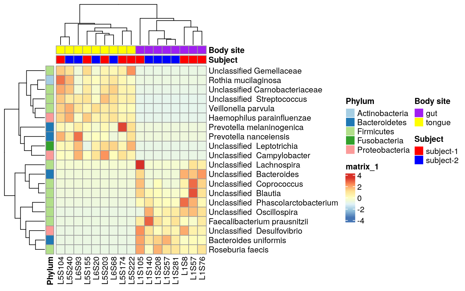
ANCOM-BC
Here I will introduce another statistical method specially designed for Microbiome data. I like its theory behind - sequencing is a process of sampling. For a microbial community under adequate sequencing, the ratio of two specific taxa should be theoretically the “same” when calculated using either the profiled relative abundances or the absolute abundance. The theory can be found in their published paper. ANCOM is one recommended method by QIIME 2 and similar theory is also adopted by another QIIME 2 plugin- Geneiss. ANCOM is originally written in R and hosted in NIH, but the link has expired now. The q2-compositon plugin is one accessible version to my knowledge. In that QIIME has no official R API, I recommend using improved ANCOM version e.g. ANCOM 2 or ANCOM-BC. These two have not been included in QIIME 2 and maintained by the lab members of the original ANCOM paper. The key differences between ANCOM 2 and ANCOM are how they treat zeros and the introduced process of repeated data, and more can be found in the paper. Considering the structure of code, ANCOM 2 is more like a wrapped R function of ANCOM, especially relative to ANCOM-BC. ANCOM-BC inherited the methodology of pre-processing zeros in ANCOM but estimated the sampling bias by linear regression. Besides, it provides p values and according to the author, it is blazingly fast while controlling the FDR and maintaining adequate power. ANCOM-BC is maintained at bioconductor, and a vignette is here. It’s worth noting that ANCOM-BC is in development and now (Jan 2021) only support testing for co-variates and global test.
ANCOM-BC is adopted here to repeat the test above. Here it takes gut label as a reference to other body site groups.
# pairwise comparison between gut and tongue
ps.taxa.sub <- subset_samples(ps.taxa, body.site %in% c("gut", "tongue"))
# ancombc
out <- ancombc(phyloseq = ps.taxa.sub, formula = "body.site",
              p_adj_method = "holm", zero_cut = 0.90, lib_cut = 1000,
              group = "body.site", struc_zero = TRUE, neg_lb = TRUE, tol = 1e-5,
              max_iter = 100, conserve = TRUE, alpha = 0.05, global = TRUE)
res <- out$res
# select the bottom 20 with lowest p values
res.or_p <- rownames(res$q_val["body.sitetongue"])[base::order(res$q_val[,"body.sitetongue"])]
taxa_sig <- res.or_p[1:20]
ps.taxa.rel.sig <- prune_taxa(taxa_sig, ps.taxa.rel)
# Only keep gut and tongue samples
ps.taxa.rel.sig <- prune_samples(colnames(otu_table(ps.taxa.sub)), ps.taxa.rel.sig)
Heatmap may not be a good choice to visualize ANCOM-BC results.
Wstatistic is the suggested considering the concept of infering absolute variance by ANCOM-BC (Github Answer). You can follow the official ANCOM-BC tutorial。 Here we just take a quick look at the results through heatmap.
Repeat heatmap script for the ANCOM result
matrix <- as.matrix(data.frame(otu_table(ps.taxa.rel.sig)))
rownames(matrix) <- as.character(tax_table(ps.taxa.rel.sig)[, "Species"])
metadata_sub <- data.frame(sample_data(ps.taxa.rel.sig))
# Define the annotation color for columns and rows
annotation_col = data.frame(
    Subject = as.factor(metadata_sub$subject),
    `Body site` = as.factor(metadata_sub$body.site),
    check.names = FALSE
)
rownames(annotation_col) = rownames(metadata_sub)

annotation_row = data.frame(
    Phylum = as.factor(tax_table(ps.taxa.rel.sig)[, "Phylum"])
)
rownames(annotation_row) = rownames(matrix)

# ann_color should be named vectors
phylum_col = RColorBrewer::brewer.pal(length(levels(annotation_row$Phylum)), "Paired")
names(phylum_col) = levels(annotation_row$Phylum)
ann_colors = list(
    Subject = c(`subject-1` = "red", `subject-2` = "blue"),
    `Body site` = c(`gut` = "purple", tongue = "yellow"),
    Phylum = phylum_col
)
ComplexHeatmap::pheatmap(matrix,
                         annotation_col = annotation_col,
                         annotation_row = annotation_row,
                         annotation_colors = ann_colors)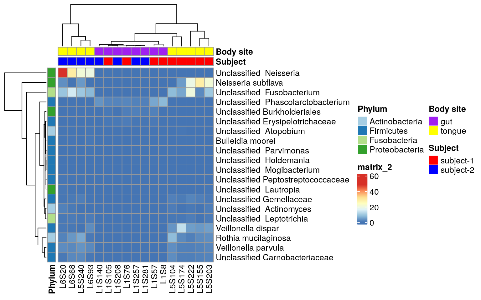
The tour shall end here. In that you know how to import the microbiome data in R, you can continue exploring your data according to diverse tutorials including phyloseq from U.S., ampvis2 from Denmark, and MicrobiotaProcess from China.
If you want a GUI software for your microbiome analysis, you may like microbiomeanalyst, which was recently published on Nature protocol.